

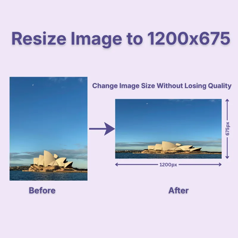
Create perfectly sized 1200 × 675 pixel images in seconds without manually calculating width and height, making it suitable for widescreen website graphics, featured images, presentations, and other digital layouts that require this proportion. Simply upload your image and download an accurately resized version ready to use.
Keep the default 1200 × 675 pixel size, or enter custom dimensions using pixels, inches, centimeters, or millimeters whenever your project requires a different size. Enable Lock Aspect Ratio to automatically maintain the original image proportions and prevent unwanted stretching. You can also choose Stretch, Crop Fit, or Fixed mode to control how the final image is resized.
Prepare images for both digital and print projects by adjusting the DPI and image quality before downloading. Rotate, flip, zoom, change the image shape, and preview your edits before downloading. These built-in options help you fine-tune your image while keeping the resizing process fast and convenient.
Import images from your device, Google Drive, or Dropbox, or simply drag and drop files into the upload area. After resizing, download your image in JPG, JPEG, PNG, WEBP, or GIF, making it compatible with websites, presentations, social media, documents, and digital publishing platforms.
Resize images online without creating an account or installing software. Your files are processed securely, helping protect your privacy throughout the resizing process while allowing you to generate accurately resized images quickly and at no cost.
Access the image resizer from Windows, macOS, Linux, Android, iPhone, iPad, Chromebooks, and tablets using any modern web browser. Whether you're working at home, in the office, or on the go, you can resize images anytime without device restrictions.
Other useful information
Explore our visual guides and infographics
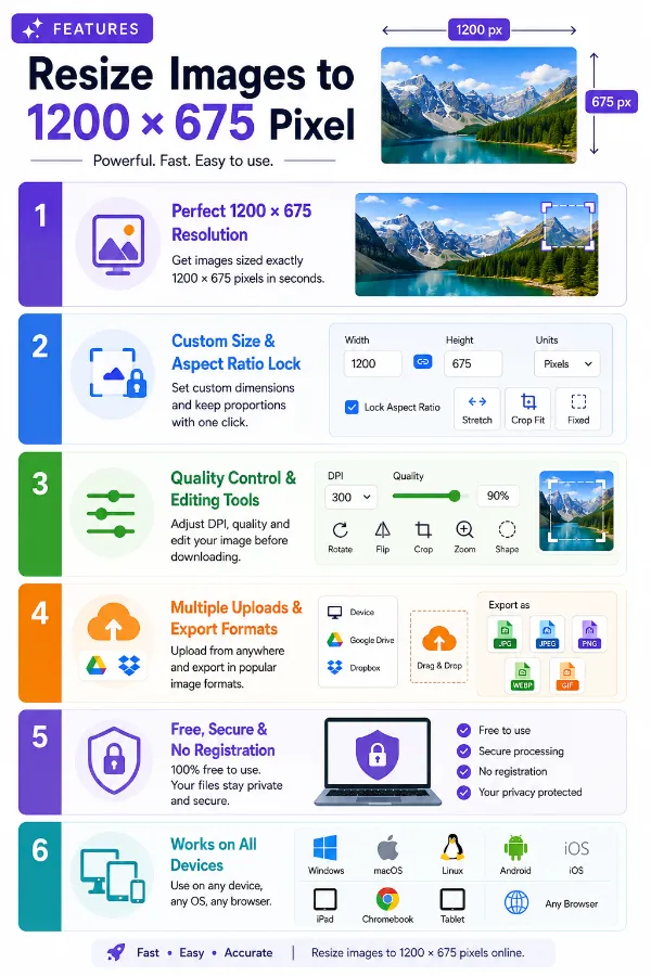
The infographic outlines the main features of the image resizer to 1200 × 675 pixels.
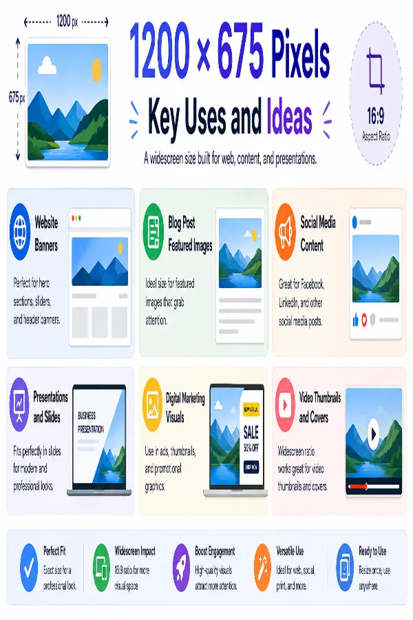
The infographic presents creative ways to use 1200 × 675 pixel images for websites, social media, banners, thumbnails, and digital content.
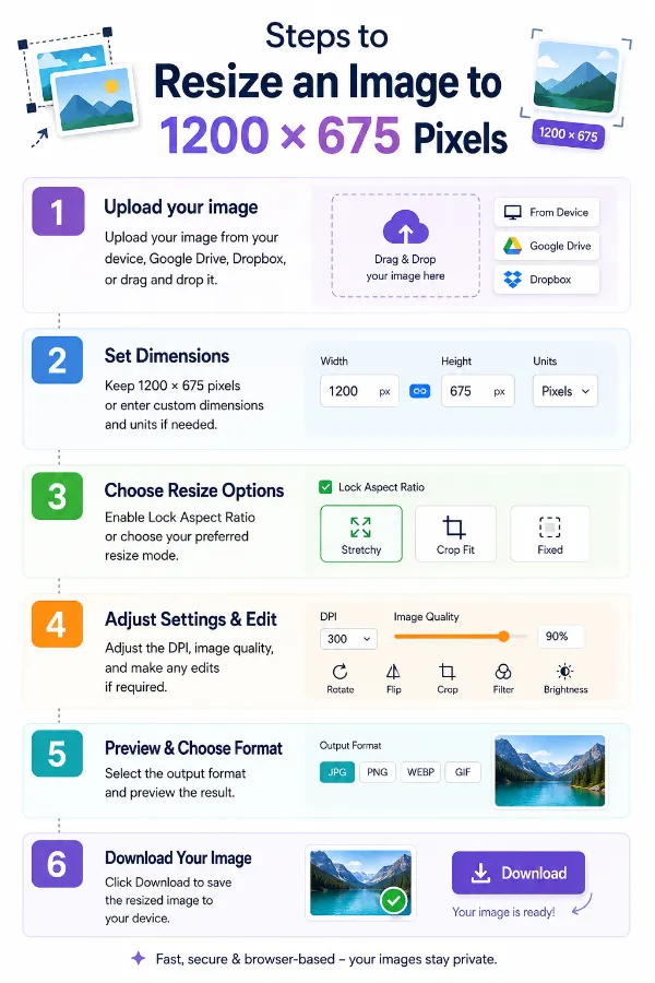
The infographic shows the process of creating a 1200 × 675 pixel image by uploading, adjusting the dimensions, resizing, and saving the result.
Frequently Asked Questions
A 1200 × 675 pixel image has a 16:9 widescreen aspect ratio. It is commonly used for blog featured images, website banners, presentations, digital marketing graphics, social media posts, and other online content.
Upload your image, keep the default 1200 × 675 pixel size, or enter custom dimensions if required, choose the resize mode, and adjust the DPI and image quality, then download the resized image. You can also rotate, crop, flip, zoom, or enable lock aspect ratio before saving.
Lock Aspect Ratio automatically maintains the original proportions of your image while resizing. When enabled, the width and height stay proportional, helping prevent unwanted stretching or distortion.
Use Stretch for exact dimensions, Crop Fit to preserve proportions while filling the frame, or Fixed to keep the entire image visible with optional background padding.
Resizing an image to 1200 × 675 pixels can maintain good visual quality when the original image has enough resolution. Enlarging a smaller image to 1200 × 675 may make fine details or text appear less sharp.
Yes. The final file size depends on the selected dimensions, image quality, DPI, and output format.
Yes. The tool supports all image orientations. Depending on the selected resize mode, your image can be cropped, stretched, or fitted within the widescreen frame.
A 1200 × 675 image contains 810,000 pixels in total. That is approximately 0.81 megapixels.
Over 500k Users Rely on Our Image Editing Tools Monthly
Join a growing community of creators who trust safeimagekit.com for versatile image editing and processing solutions.